Yay!
I’m finally able to share that I’m the January guestdesigner over at the My Scrapbook Nook-kitclub!
It’s especially fun, as the Januarykit was chock-full of “Hot Chocolate” from Fancy Pants Designs, the collection that debuted after my term with them were over. So it meant I got to play with that collection after all, yey! :)
I quickly created two layouts and a card with it, and I have plenty of stuff left (and ideas for more) so there’ll be more stuff created with this kit incoming in not too long :) So – embrace yourself, here’s my Nook-stuff so far:
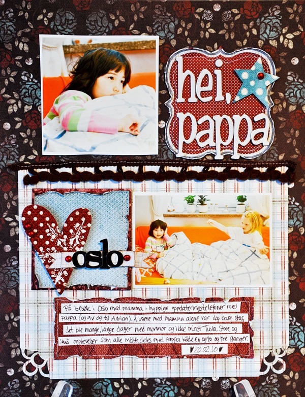
A layout documenting a trip to Oslo last year, with just me and Amalie – which meant frequent phonecalls home to update them on the events of the stay.
Here I worked a lot with the Helmar Scrap Dots glue – I love that glue because it allows me to decide the dimension of my embellishments myself (it’s a “liquidish” 3d glue dot in a tube). And it’s perfect for me because I often leave my projects overnight, so it’s one of the last things I do before leaving for bed and the next day the glue is dry and good to go :) The glittery red brads are from Queen & Co, also in the kit.
We got two kind of letters in the kit – white AC chipboard ones, and dark brown FP stickers. Yay!
Everything on the layout is from the kit by the way…hm..apart from the banner and the text-strips, which were just created by scraps I had on my table :p
Kaffelade! A small, cozy café downtown.
The white cardstock is from my own stash – in fact – I had it premade (adding splatters of glimmermist onto it), thinking I’d use it for another project a while ago, but decided against it and saved the cardstock for future use – aka this project :)
Love this butterfly-punch from Martha Stewart – so elegant :) And the borderpunches :)
I actually created the borders for the first layout-project above (“Hei, pappa”), decided not to use it and then just adding it here where it fit better.
Use that negative space! :) The bling seen here are from the kit – we got a red piece of swirl from Queen & Co in the kit – and I have to admit I find such swirls a bit hard to use – so I just cut out individual gems from it for my layout.
Love this kind of splatter – huge, with random edges :)
You know these 12x12 sheets with smaller cards/tags on them? Look for two fitting cards next to each others, which can be cut out together and used to create such quick minicards.
Here I just added bling and letters to the cover of the card..
And decorated to reinforce the insides of the card with more pieces from the same 12x12 card-paper.
And added this cute little sticker-stamp, adhering it with the liquid scrap dots glue.
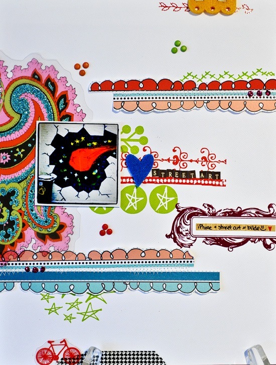
Now, I have to admit – while creating this layout I loved it, but now I positively dislike it. Hrm. Still have to share it though, as it’s for the Pencil-Lines sketch #221. White cardstock, transparent glittercut and felt from Fancy Pants, houndstooth-tape from Pink Paislee, paperscraps from Bam Pop, lots of rubons from Hambly Screenprints (the rub-ons I own are so random, while some are drying out, others are still going strong even though they’re among the oldest ones.
I’ve decided I’ll be better to use the rub-ons I own because quite frankly, it SUCKS to have to throw away whole sheets you just wanted to hoard because you loved them too much to use them…..:(
Nevertheless. Do check out Cheryl Ashcrafts sketch, it’s pretty lovely!
~Sasha Farina~ Said,
paperdolls? what are you? 8? LOL.. *i'm just jealous by the way.. :P*
But ofcourse! *huge grin* Love you still!
Have a lovely week! :)


